Why Were Older Pokemon Games More Memorable?
Learning about making memorable Adventure Games by thinking about some classics...
Were older Pokemon games better? Have newer ones gotten worse? If so, in what ways, and how do we explain that many past and present fans feel this way about the series?
In a random tweet thread that unfortunately got slightly popular on my personal vs. work account (agh! Please play the Angeline Era Demo… (cry, cry)), I tweeted:
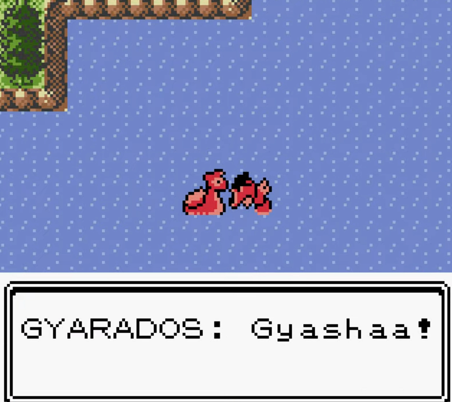
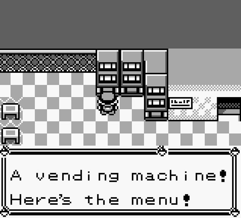
Looking at Pokemon fan art, or recent Pokemon Gold/Silver lore videos, it's so obvious what made Pokemon work - not just the creatures, but those little memorable vignettes: The lake of rage Gyarados, lemonade machines (in Red/Blue), the tiny but expressive level designs…
…In an adventure game, if every screen embodies whatever mode of interaction you picked, it’s easy to weave a storybook feel even with really simple vignettes. Adventure games are like writing through level design…
…You can't only mechanics your way to a memorable adventure - you have to use mechanics as a toolkit for stories... even if those stories don't have words all the time.
It seems I got the gist across, but the tweets lack detail. Why is it that a game that I haven’t played in decades still had memorable moments? I think it’s easy to be cynical and say it’s from being a kid, but I still play games every few weeks that leave deep impressions on me.
Here’s this post’s thesis: Adventure games become memorable when they take players through gameplay segments/vignettes that explore the edges of the game’s design space. Whoa! That sounds abstract… how does this apply to Pokemon, and more widely, Adventure Games?
Design Space
“Design Space” is a loose term. Let’s define it like this. If you were to keep a journal of all the things you did in Pokemon Red, you’d end up with statements like “I caught Pikachu on Route 4,” “I found a Full Heal behind the Supermarket in Pewter City,” or “I fought the 6-year-old Bug Trainer in Viridian Forest, but underestimated him, and ate shit.”
Design Space is a box that contains all of these statements that would describe playing the game. If you were to keep writing these down, you’d start to see trends: a lot of statements about fighting trainers, catching Pokemon, walking in wild grass, finding items, exploring caves, planning on who to evolve.
But there are some sentences that would only pop up once or twice, or be hard to group in with others. For example:
Found a lake with an angry Red Gyarados!
Found a vending machine that sells lemonade and some other things
Gambled at a casino
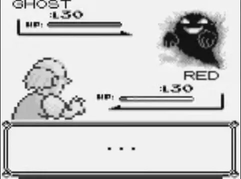
Ran into a ghost I couldn’t defeat in a tower…
Defeated the Elite Four Champion!
Blocked from going somewhere by dancing NPCs
Discovered the entire Pokemon Red/Blue after the Gold/Silver Credits
… etc.
While still part of the design space of Pokemon, they are rarer/extreme - and so are more towards the edges of the design space. For example, gambling at a casino is “Closer” to a gambling game’s design space. Running into that ghost is close to horror games’ design spaces. Beating the Elite Four is a climax, vs. the more common experience of beating Trainers.
When a vignette pushes at the edge of a design space, it is surprising, memorable, maybe emotional, maybe resonant with something we didn’t expect. But it still relates enough to the game, that we understand this vignette as “part of the Pokemon game.”
That is, the moments can’t simply be random and unrelated, they have to somehow connect to the base design space. A casino is surprising inside of any kid’s game, but what makes it extra memorable for Pokemon is that the credits you can win tie to actual things you use in the game. The ghost in Lavender Town interrupts what seemed like a regular dungeon. The Red Gyarados requires you to surf to it, fight it, and is captureable.
Put another way, while you could do things like suddenly make Pokemon turn into a… 3rd person shooter! It would certainly feel bizarre and memorable, but… in the long run it might not feel as memorable as something that tried to relate to the base game more. That’s… not to say you can’t just shift from one genre to another in a game… (fans of my Anodyne 2 would certainly know…) but it’s something that has to be done with consideration for the base experience - even little moments that catch people by surprise.
The nice thing with adventure games is that you have a pretty wide margin of what you can put in. For example, in Pokemon, even something as simple as the layout of a town, or a weird path in a forest could be memorable, which brings me to another point - how does art style play into memorability?
2D vs 3D and Communication Density
A common sentiment with Pokemon is that it’s become less memorable with the shift to 3D. Why? First, I don’t see 3D as necessarily inferior at making memorable adventure games. But I think there are reasons why games with tile-based 2D art can often seem to be more memorable.
There’s the subjective dimension of this - which is that lower-fidelity art is abstracted, so it lets players fill in the blanks with their imagination. This is certainly part of it! When making an adventure game it’s important to recognize that people bring their own experiences to the table: what looks like simple tree sprites can easily conjure up their own memories of tiptoeing through the woods.
But I think that’s insufficient. There are plenty of mediocre Game Boy games with pixel art trees.
What I think is more important is that when a level designer has a small set of tools to work with: placing items, tall grass tiles, trainers, and the spaces themselves are small - this means that much of the game’s world has high communication-density (or, that most visuals also have a corresponding game design function). Maybe it’s “wow, this place is dangerous!” or “wow, I’m in a canyon!” or “I could risk going through tall grass to reach that item!”. If the component parts of a game’s levels are meaningful enough, then they can form a design language with which to create a solid baseline experience - which can then be built on top of to create memorable experiences at the edge of that game’s design space.
Put another way! If your game’s tall grass has various meanings (fear! from wild pokemon. anticipation - looking for rare pokemon. etc..), then you can create a memorable experience simply by making a really big room and filling it with grass!
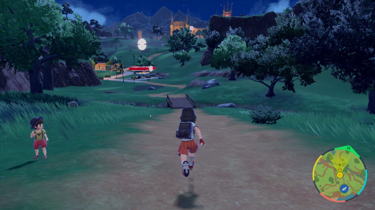
Meanwhile, if your game looks like this:
Then most of the time the game is communicating “there is nothing here: just go to the obviously important areas”. The design elements are so far apart, so interrupted by set-dressing art, that it becomes tricky for the game to really form a meaningful sentence or paragraph beyond some simple ones like “whoa big open space!” Rather than a game trying to create vignettes with its design language, there’s an overadjustment toward using cinematic methods of communicating meaning about the game’s world.
I think the technical restraints of early 2D made it a lot more likely for designers to make a game with high communication-density levels. Maybe because back then, there was less pushback from the marketing and executive teams about needing to make a ‘visually appealing game!’ On earlier hardware, art in games was tightly coupled with design, because there was less room for art to become increasingly abstracted from the design.
You absolutely can make memorable adventure games in 3D or 2D, but it requires understanding that the art and design teams will have to do a lot of communication. I’d argue it’s important for artists to also have an interest in level design. It’s easy to misstep nowadays - even something like picking an overly HD aspect ratio can make it tricky to achieve a sense of ‘lived-in-ness’ in games. For example, this HD Link’s Awakening mod obliterates the way that the camera framed each screen-sized room communicated to the player.
I’m a big fan of adventure games, especially action-adventure ones, which is why personally I’m invested in thinking about ways to make 3D action-adventure games that are relatively ‘communication-dense’.
For example… (self-plug)… my upcoming game Angeline Era (there’s a demo out now!) is built upon various rules and mechanics and art styles that allow for a wide range of experiences, on top of the baseline action and exploration. (Check out the demo to find out how!)
Like Real Life…
To put it another way, I think the way memory-making forms in adventure games is a bit like real life. Sure, we could watch TikTok feeds or funny video compilations, but it’s unlikely we’ll remember much of the experience. It’s just one extreme thing after another.
On the other hand, if we’re doing something that is just pretty regular - talking with a friend at a restaurant, walking around outside - then when something out-of-the-ordinary happens, it takes on a memorable significance - it connects directly to our lived experience.
I love adventure games because the memorable moments feel like they capture some essence of what their creators find entertaining or interesting about life. It makes me appreciate having random encounters in real life, as well reminds me that it’s a nice feeling to know that you can be a meaningful ‘random encounter’ for someone else, too.
Subscribe for free!
Related post: You may enjoy reading about the 3D level design/communication of our game Sephonie - or its puzzle design.




Really loved this post. As you can tell from my avatar, I think a lot about Pokemon :-) I think you're right here that there's a lot of *weird* elements in those earlier games that make them memorable... and it's sort of interesting that subsequent remakes of those games remove a lot of those weird things. Like, the gambling minigames just... stopped being a thing (mostly to appease the ESRB, I'm pretty sure). The weird thing is that no one really liked these elements - the Safari Zone minigame stuck around even though everyone hated their dumb mechanics that made it artificially difficult to catch a frickin' Tauros! - and yet removing them makes the games feel kind of bland!
> Rather than a game trying to create vignettes with its design language, there’s an overadjustment toward using cinematic methods of communicating meaning about the game’s world.
This bit really stood out to me in the context of the franchise. IMO the last really memorable or interesting Pokemon game is Black/White, in part because it's really embracing cinematography in a way that feels very deliberate - like, the setpiece that really stands out to me is when you're walking on the big bridge, and the heretofore-static camera starts wilding out, doing these really extreme zooms out that emphasize how small you are relative to the big city you're about to enter: https://www.youtube.com/watch?v=IE16BT9RFEc
The standard complaint is that the later Pokemon games are overloaded with cutscenes, which is objectively true lol, but when B/W does it it feels... deliberate! Like, the game is explicitly wresting control from you to emphasize how powerless you are during these big moments. (It helps that these are the games that are canonically set in a Pokemon version of America, so it feels like they're explicitly channeling Hollywood films - e.g. a plot twist concerning the game's villain takes place on a Ferris wheel in a scene I'm 100% sure was a deliberate homage to "The Third Man.") Whereas once the series goes truly 3D in X/Y, the cutscenes are used to stage conversations between groups of totally forgettable characters. (X/Y is also just a weirdly conservative/nostalgic game in a way that makes me suspect Nintendo was walking back the deliberately alienating aspects of its predecessor - sort of a Rise of Skywalker situation)
I just played the Angeline Era demo now, and I really liked the mini game that the player has to play when discover a new area on the map! Very memorable!